Water-based ink comparison test
I’ve tested Cranfield’s inks alongside the water-based inks that I use for teaching made by Nerchau and the water based inks by Graphic Chemical that I use for my own work. Teaching and editioning personal work make slightly different demands on the inks as follows:
Teaching
My group students work with the reduction method without a press. They do not mix colour, they use the inks as they come from the manufacturer and a few colours I have premixed in advance. However they print several copies of their work in an assortment of colour layers. Teaching in this way requires ink that stays open when mixing yet dries fast on paper, is economical and reliably available, comes in appealing colours and is opaque as possible. Novices cannot be expected to allow for colour changes caused by previous layers of ink so the ink’s ability to print as true as possible over another colour is preferred.
Editioning
I require inks of good quality, colourfast with reliable pigments. It is essential that I can ink up large areas with perfectly uniform coverage, manage colour bleeds and general inking up without any blotches or roller marks. I have the benefit of my experience, an Albion Press and I am able to give long drying times and can manage colour transparency and layering.
Test Conditions
All three inks were tested straight from their container with no colour mixing.
They were used in normal studio conditions at a room temperature of 18-20c.
I used the same soft Japanese rubber roller for inking up all the inks (the three blue handled rollers in the photos were not used for inking, merely to show the ink’s texture on an economy roller).
The same piece of lino was used and was carefully cleaned between each test.
I used the same press and the same pressure.
Fabriano Rosaspina 285g was used throughout.
One: Texture of inks
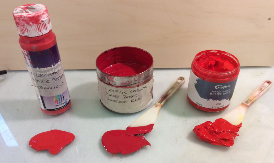
Prior to printing |
Nechau |
Graphic Chemical |
Cranfield |
Container |
Squeezy bottle |
Tin |
Plastic tub |
Taking ink |
Squeeze |
Palette Knife |
Palette Knife |
Consistency |
Consistency of ketchup |
Slowly lost shape into stiff liquid |
Held Shape |
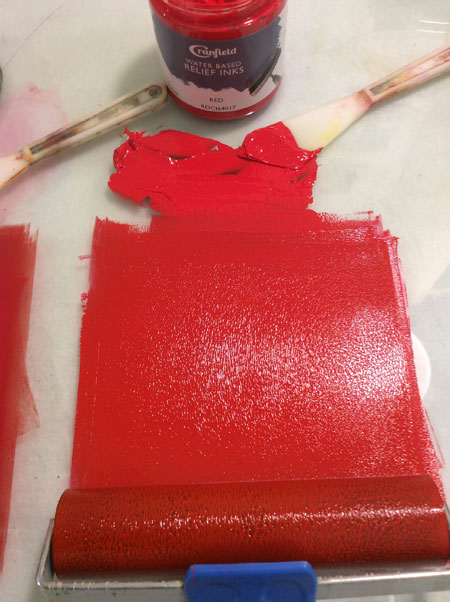
Rolling out with economy roller just for photograph (Essdee soft roller) |
Runny but easy to roll out. Slightly patchy on roller |
Residual areas of mottled thick ink as it rolls out, stiffer than other two & harder to get a cohesive layer on the roller |
Softer than expected but rolled well. Looks beaded but completely uniform on the economy roller |
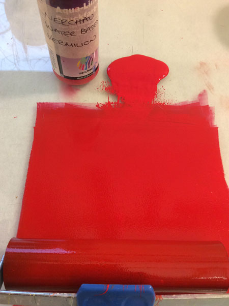
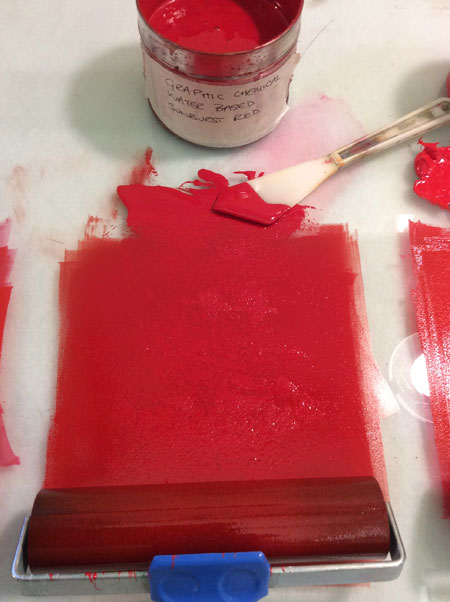
Two: Single Colour Printing
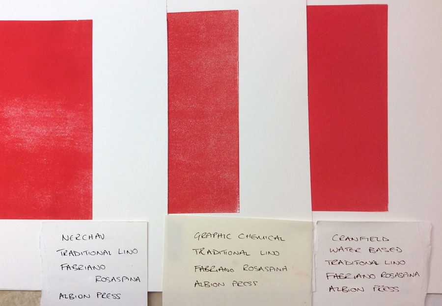
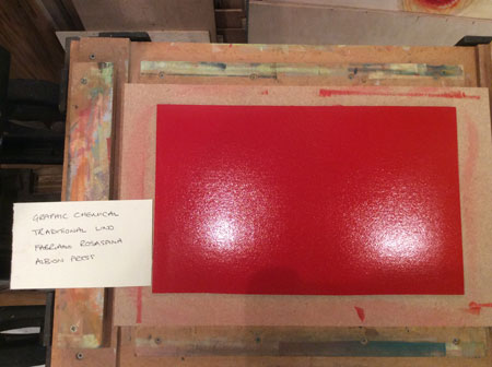
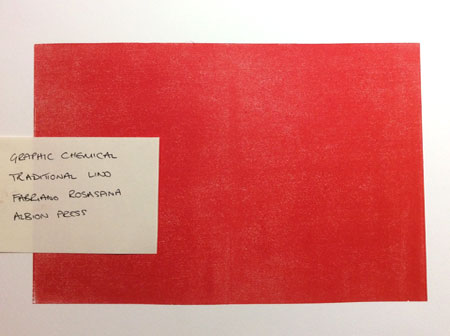
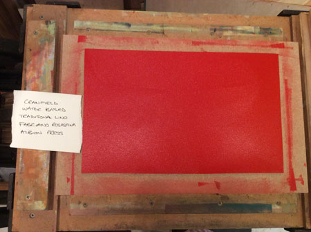
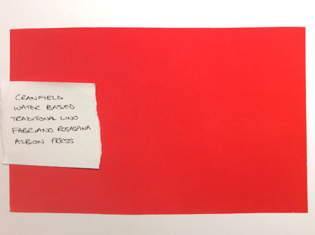
Using Artist’s Lino gently sanded on Albion Press |
Nechau |
Graphic Chemical |
Cranfield |
Rolling out with soft Japanese roller (used for all inking in the tests) |
Easy to roll up, but soft enough for a novice to make roller marks or ink unevenly without guidance. Softer than Cranfield and harder to see if the ink is spread cohesively |
Requires more effort to get a uniform layer than other two, but not as subject to roller marks as the others |
Not beading so much and easy to roll up onto the lino cohesively. Soft enough for a novice to make roller marks or ink unevenly without guidance |
Result of printing |
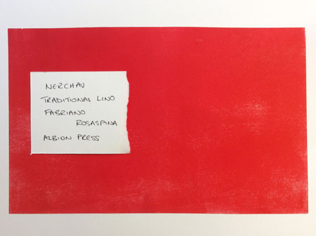
Slightly disappointing coverage on paper compared to ink’s appearance on the lino |
Slightly disappointing coverage on paper compared to ink’s appearance on the lino, would need double printing or more ink than I would normally apply for a uniform layer |
Excellent coverage and completely uniform appearance. Dense pigment |
Drying time |
Dry at 15 mins |
Dry at 15 mins |
Dry at 15 mins |
Three: Adding three additional layers of colour
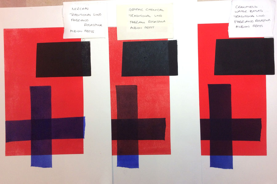
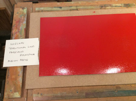
I printed four layers in total with 15 min intervals between each blue layer to simulate the worst possible conditions of fast printing in a short class and a gap of 30 mins before the black layer. (Normally I would only ever print two layers max in 24 hours. All the inks performed well with the short drying times between layers.) However I was using a professional roller and am very experienced in rolling out ink. It should be remembered that students with student rollers and inexperience may not do as well.
Specifications |
Nechau |
Graphic Chemical |
Cranfield |
Layering appearance when wet on paper |
Between the other two in transparency, but more mottled in appearance |
Slightly transparent but uniform appearance |
Dense uniform appearance |
Layering appearance when dry on paper |
Blue overlays have best ‘blue’ retention over the red of the three and are least affected by the underlying colour, but the black is weaker in pigment than the others |
Noticeable reaction with the black overlay compared to the other two causing a contrast between the black on paper and the black over the other layers of ink |
Dense and most uniform result, notably so. |
Clean up |
Easily cleaned away with a damp cloth and water |
Easily cleaned away with a damp cloth and water |
Easily cleaned away with a damp cloth and water |
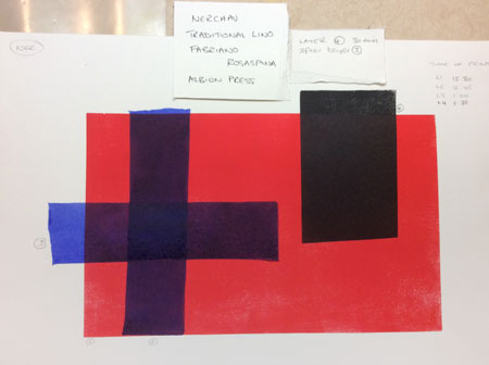
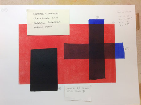
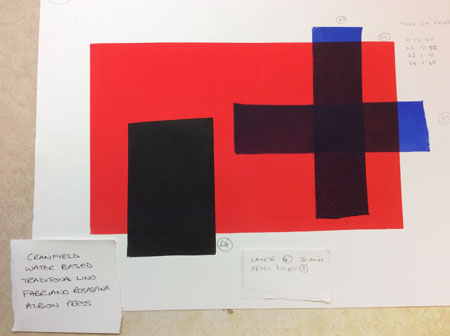
Four: ink staying open on the mixing slab
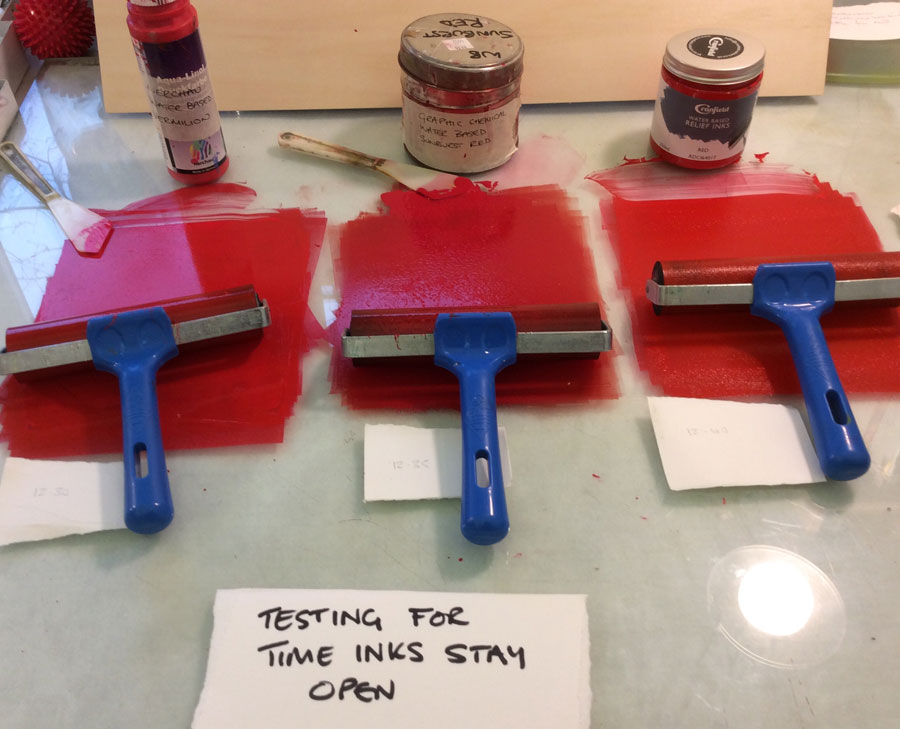
I tested all the inks rolled out for printing to simulate the worst class conditions where inks are left rolled out rather than in a dollop. All the inks stayed open an unexpectedly long time, far beyond anything I would expect to require in a class or for myself.
Time Intervals after rolling out |
Nechau |
Graphic Chemical |
Cranfield |
30mins |
No change |
No change |
No change |
1hr |
No change |
No change |
No change |
1hr 30mins |
No change |
No change |
Slighty tacky |
2hr |
No change |
No change |
No change |
2hr 30mins |
Slighty tacky |
Slighty tacky |
More tacky |
3hr |
No change |
More tacky |
Wouldn’t use |
Five: Availability and Cost
I have just used the suppliers I deal with at present to give an idea of price etc, this is not an exhaustive overview.
Criteria |
Nechau |
Graphic Chemical |
Cranfield |
Colour range |
12 colours no extender (Great Art) |
8 colours in tubes, 12 colours in tins plus extender (Intaglio Printmaker) |
14 colours, extender, ink modifier (didn’t test extender or modifier) listed by manufacturer. (5 colours and extender carried by Handprinted) |
Quantity |
200ml bottle |
¼ lb tube / 1lb tin |
250ml jar |
Cost |
£8.95 |
£11.58 tube / £20.40 tin |
£9.60 |
Wastage by artist |
Some wastage at the end of use as last few teaspoons hard to access |
||
Wastage by student |
Very little wastage as students squeeze the individual bottle and don’t use a palette knife. Wastage at end as before. |
May scoop out more than needed and could mix up palette knives and muddle ink colours in tin. |
May scoop out more than needed and could mix up palette knives and muddle ink colours in tin. |
Notes |
Great Art often give good discounts on these inks, which makes them more financially attractive if you can wait, stocking up when the price is dropped. |
I have had issues with obtaining some colours of Graphic Chemical in the past and some inconsistencies in the texture of the inks. No problems recently. |
Cranfield’s inks are a new product so suppliers may be limited at present (the company can inform you on this better than me.) Bear this in mind when comparing with the two established products. |
Conclusion
This is a basic test of the three inks. I did not mix colour or use extender and nor did I work by my usual reduction method.
For teaching
I do not use Nerchau inks for my own work as I find the pigments too chalky and conventional. I don’t like using their bottles under studio conditions. However, I will still prefer to use Nerchau for my students in preference to Cranfield and Graphic Chemical because it is their chalky pigment and predictable colour that allows novice students to layer colour straight from the bottle with the colour minimally affected by the previous layers of ink. In addition, the bottle I dislike in the studio works well in a class as students can’t muddle inks with knives and find it easier to judge how much is needed.
For Me
I will be using Cranfield’s inks to edition a print shortly and will give a report on their performance under my usual printing conditions. I’ll have a much better idea of the colours and how they mix etc after finishing a print. However, I am very encouraged by these tests and, as long as my editioning goes well, will have no hesitation in switching to Cranfield in preference to Graphic Chemical as I use my current stock of ink. I prefer Cranfield’s texture and their coverage is significantly better for my kind of work. They are good value and I hope all colours will be readily available soon. However, I would put in a word for the dark maroon colour and the acid lemon yellow from Graphic Chemical, which are marvellous.

